Thursday, December 10, 2015

Activity 12: Caculating and comparing volumetric analysis methods in Pix4D and ESRI software

Introduction

Mining applications are an up and coming use of UAV technology. A good local application of this in Wisconsin is frac sand mines.One of the most important values that mines are interested in is volume. An easy and very cost effective way to do this is through the use of UAV imagery from which you can calculate volume or in other words conduct volumetric analysis. Using a simple mosiac created from a series of UAV collected images volume can be accurately measured using image processing software. Volume calculations help the mines track how much material they are extracting in tailing piles or piles of the product they are after. They need to keep track of how much frac sand they are extracting and also how much they are moving through the plant in a given amount of time. They also calculate how much material would have to be removed to get to the target product. This is done to determine whether an area is worth the time and money of product extraction. Employee safety is another consideration that make UAVs a more logical choice. Instead of having a survey crew walking down in a mine or throughout the mine where they could be injured by machinery or cave-ins imagery can be collected from a safe distance away from operations. Finally cost, which is probably the biggest advantage of using UAVs is considered. There are other methods of calculating volumetrics including LIDAR and a manual survey team like I mentioned earlier. LIDAR can be very accurate however the price tag to have a mine scanned with LIDAR on a regular basis is just too expensive. Survey crews which usually are made up of 5 to 10 or more individuals are expensive as well and are not nearly as time efficient as UAVs are.  In this activity we are focusing on two software programs, Pix4D and ArcMap, to compare the volumetric calculations from each. The UAV collected imagery we are using is from a local aggregate mine just outside of Eau Claire.

Methods

Study Area

The Litchfield Mine is about 5 minutes south of Eau Claire. It is an aggregate mine and the area we are working with is where all of the storage and sales piles are located. Figure 1 is a map of the storage area. For this activity 3 piles throughout the study area were chosen. The piles I choose are outlined in red, orange and yellow.
Figure 1 This is a map of aerial imagery collected using a UAV of the Litchfield Mine close to Eau Claire. The 3 piles I chose to conduct volumetric analysis on are highlighted.

Pix4D Volume

The first method used to find volume is using the Pix4D image analysis software. Of all the methods explored this was by far the fastest and easiest to do. See Activity 10 for further information on making measurements in Pix4D. To conduct simple volume measurements in Pix4D you go to the top tool bar and click the volume measurement tool. This will change your cursor to a little green dot. Use your cursor to outline the base of the area you are interested in the volume of. In my case chose 3 different piles to calculate. You can see in Figure 1-3 the green outline of the piles, that is what you are creating in this step. Once you have placed points all the way around the base of the object right click and this will close the shape outline. In the left hand side of the window a picture of the outline you just created will appear as well a box above it with a tab that says calculate values. Click this tab and Pix4D measures the volume of the outlined object. When the calculation is complete the object will turn red (Figure 2-4). The red area is what Pix4D is calculating the volume of. If this doesn't match the area  you were trying to measure delete the outline and try again. One the calculation is complete the area over the calculate values tab will fill in with a variety of measurements one of which is volume. This is the value we want. Figure 5 are the resulting calculations for each of the piles I measured.
Figure 2 This is the first pile I chose to do volumetric calculations on. If you look in Figure 5 this  is the measurements under Volume 1

Figure 3 This is pile two. Notice the red cover over the pile in the image on the left and the green outline on the right. All the Xs in the right image are every where I placed a point to outline the pile. In Figure 5 this is  Volume 2.

Figure 4 This is the final pile I calculated using the same procedure as the first two. In Figure 5 this is Volume 3.
Figure 5 This are the measurements Pix4D calculates when an object is outlined using the calculate volume tool. It is nice that many other calculations are included and not just volume in case you need to know area and other measures.

Raster Volume

Two methods of volume calculation were explored in ArcMap, the first of which is calculating volume from a raster. In order to do this calculation we had to use 3D analyst. The first step is to create a polygon feature for each of the piles you want to find the volume of. These polygons do not have to be tight to the bottom of the pile they can just be a rough outline of the area around the intended pile. Once these are created the extract by mask tool is used to essentially pull the area contained in these new features out of the mosaic raster of the mine. Once this tool is run what you are left with is 3 chunks of the raster each of witch are roughly outlining the piles of interest. Once the 3 pile areas are extracted the next step is to use the identify tool to get the elevation of the area around the base of the pile. When using the identify tool just click anywhere around the base of the pile in the raster clip and a window will open with a pixel value. This pixel value corresponds to elevation. Next using the surface volume tool (Figure 6) I calculated the volume of each pile. Load the raster clip of the pile you want to calculate into the surface box and select a location where a text file with the results will be saved. Next that pixel value you recorded gets put into the plane height box. Leave the other defaults and hit OK. The tool will run giving you the text file output with the pile volume. Figure 7 shows the work flow for this method of volume calculation.
Figure 6 This is the box to set up the surface volume tool when calculating volume using the raster data set. Notice the plane height value that I set based on the pixel value I collected with identify tool. I did that for all 3 piles.
Figure 7 Workflow for the volume calculation using a raster data set in ArcMap

TIN Volume

The final method I used was calculating the volume using a TIN. A TIN is a Triangulated Irregular Network. The TIN is created by using the raster to TIN tool in ArcMap (Figure 8). Basically what this tool does is based on the raster and a set z tolerance creates a new surface comprised of a bunch of triangles. The TIN allows for 3D surface modelling based on calculated elevations.Figure 9 shows how a TIN surface compares to a raster surface. The more points you choose when creating the TIN from the raster the smoother the TIN surface will be and the less areas you will have where the z tolerance is approached. 
Figure 8 This is the set up box for the raster to TIN tool. You can see the number of points used to create these TINs. To increase accuracy this number can be increased but the tool will take longer to run.

Figure 9 This is an illustration showing the difference between a raster surface and the TIN that is created from it. It also shows the z tolerance limit. The more points that are used when creating the TIN the better the green line would match up with the blue line increasing the accuracy of the TIN.

Once the TIN has been created from the raster the next step is to use the add surface information tool (Figure 10). This tool needs to be run on each TIN and the value that I was most interested in is the z_mean field. This field is used in the volume calculation tool. Once the info tool is run the final step is to run the polygon volume tool (Figure 11). This tool is for TINs only it shouldn't be used on raster data sets. The z_mean field is used in this tool instead of using the identify tool to pull a pixel value like when using rasters. Once the tool has completed the volume will get added to the attribute table of the polygon file associated with each different pile chosen earlier. Figure 12 is the work flow for calculating volume from a TIN.
Figure 10 This is the surface information tool. This is what you do instead of getting a pixel value like we did with the raster data set. The z_mean is calculated so that it can be used in the polygon volume tool.
Figure 11 This is the polygon volume tool used to calculate volume when dealing with a TIN. This is where the z_mean value comes in. It would be selected in the height field box.
Figure 12 This is the workflow to calculate volume using a TIN in ArcMap

Results

Figure 13 This is the final comparison of the 3 methods of volume calculation
Looking at the table (Figure 13) the results are obviously not the same for each technique. The Pix4D values are the most accurate of the 3 methods. Pix4D does a much better job of calculating the volume only for the specific object you are interested than the other two methods do. Taking your time to outline the base of the object in Pix4D pays off. Even if you spend a little more time outlining it is still the fastest calculation method by far. 

The raster volumes are the closest of the other two methods to the Pix4D values however it is still off by quite a bit. This is most likely due to part of the area around the base of the pile being included in the volume calculation. This explains the elevated values. In my case there must have been quite a bit of the base area included in the calculation because some of the raster values are off by quite a bit.

The TIN values are off by a ton. Again this comes down to the number of points we had the raster to TIN tool use. We used the default amount of 1,500,000 points which was nice for quick processing but we now see that the accuracy is greatly effected by the number of points. In order to try and correct this error as best as possible more points should be added when the raster to TIN tool is run. Again that will make the TIN surface line up more accurately with that of the raster surface. Running the tool with 10 or 15 million points would greatly increase the accuracy but the run time would be increased significantly as well. 

This table clearly demonstrates which method gave us the most accurate volumes. Greater attention to detail when using the raster calculation could greatly improve the accuracy of the volume and as stated earlier the number of points needs to be greatly increases to get an accurate volume with the TIN. 

Conclusion

This activity examined 3 different methods for calculating volumes using 2 different software packages and a few different techniques. Which method is used for an actual job will be determined by what software and how much computing power is available. Pix4D is super easy to use and very convenient as far as speed of calculations but it costs several thousands of dollars and requires a large amount of computing power. ArcMap is not much better when it comes to computing power needed but it doesn't cost as much. It doesn't have the high level of simplicity that Pix4D does so you really do get what you pay for. If you have the money to get a very user friendly and powerful program like Pix4D it is definitely worth it for increased efficiency and turn around with data analysis. UAVs supply mining companies with an alternative to manual surveying and has potential to streamline operations, cut costs increase safety and potentially give the mine more accurate and more readily available data. It is fascinating where UAV technology can be used and this industry is another perfect fit where UAVs can revolutionize how the industry operates as a whole.


Wednesday, November 18, 2015

Activity 11: Ground Control Points (GCPs)

Introduction

This weeks activity was again using Pix4D image processing software but we were focusing on a new capability of the program, GPCs. GCPs are used to tie down and image to the surface of the earth so that it is spatially accurate. In this case we are using them to create a true ortho rectified mosaic. You do not have to use GCPs when processing imagery in Pix4D, however when we compare the accuracy of the images you see why it is important to use the GCPs. There are a couple of different ways to add GCPs and we talked about three of them in class.
The first method is used when the image geolocation and the GCPs have a know n coordinate system in the Pix4d database. The two coordinate systems may be different but Pix4D can automatically match them up. This is the method used the majority of the time and there is very little manual input compared to the other methods. The manual input is marking the GCP markers that are on the ground in each image that Pix4D finds them. Basically all you do is click a GCP number and images that Pix4D found that GCP in pop up and you click as close to the middle of the GCP marker in the image as possible. You have to go through this cycle a couple of times so you can not just hit run and leave however it doesn't take long to mark the GCPs. This is the method we used with out SX260 data of the South Middle School ponds. Figure 1 is an illustration of this process.
Figure 1 Work flow for the first method of using GCPs in Pix4D. Credit to Ethan Nauman for its creation.
The next method that is available in Pix4D when working with GCPs is when the images are not goelocated, or the initial images or GCPs are geolacted in a local coordinate system. This method is more manual entry. Instead of Pix4D picking out the GCPs in the images you have to manually find them and mark them training the program what to look for. As you repeat the process there will be less manual entry but the first part of this method will take some time.Again you can't just place the GCPs and images in Pix4D and let it run you have to be there to mark the GCPs. Figure  2 shows the work flow for this method.
Figure 2 Work flow for the second method. Credit to Ethan Nauman for its creation.
The final method works with any images and GCPs entered regardless of coordinate system or geolocation. If you want to be able to set up a project and let it run this is the best method to use. You will spend more time at the beginning marking the GCPs in the images but once that is done the process can run to completion. Figure 3 is the work flow.
Figure 3 Work flow of method three. Credit to Ethan Nauman for its creation.

Methods

Once you have selected a method to use for incorporating your GCPs the next step is to pick a coordinate system. When picking a coordinate system you want to chose on that is going to give you the most spatial accuracy for the area that you collected images of. In our case we chose UTM NAD 1983 Zone 15. This is a grid pattern coordinate system and zone 15 happens to lie right over the top of Wisconsin. It is a very good coordinate system for small local areas of focus and reduces the distortion compared to say a world wide coordinate system.Our GCPs were collected in NAD 1983 Zone 15 and the output coordinate system was also set to this. The images are in a different coordinate system but like I stated before Pix4D can automatically match the image and GCP coordinate systems.
Like last week images were loaded into Pix4D (see video for procedure) but this week they are already goelocated so adding the flight file was not necessary like when we used the GEMS data. We were given GCP locations which we collected in a previous activity (Activity 4 ) and they were in NAD 83 Zone 15 coordinate system. Given this information we used method one to incorporate the GCPs.
The first thing Pix4D asks for is a coordinate system and using the logic I explained earlier we chose UTM NAD 83 Zone 15 to increase spatial accuracy as much as possible. Then we began working with GCP in the GCP Manual Tie Point Manager (Figure 4). This manager tells you how many images there are that are associated with each one of the GCPs. This is all automated Pix4D finds the GCPs in each image and assigns the image to which ever GCP it is. Pix4D does a decent job of finding the GCPs but this is where the manual input greatly increases the spatial accuracy. We let Pix4D run the initialization step and then begin adding tie points. This is done by selecting the GCP and a group of images will appear (Figure 5). Pix4D picked those images out because it sees that GCP in the images but sometimes it picks images of other GCPs and makes other errors so this is where the manual input is important. You go through a good number of the images for each GCP, find the GCP marker and click as close to middle of it as possible (Figure 6). As you do this Pix4D becomes better trained in what to look for in the images for that GCP. The more images you mark the more tie points will appear next to the GCP number. For this lab we had at least 10 tie points for each GCP. The more tie points the better accuracy.

Figure 4 This is the tie point manager where you see the number of GCPs and next to that you see the number of tie points. Again we were shooting for at least 10 and as you can see we got a lot more than that for most of the GCPs which increases the image accuracy.
Figure 5 These are the images that open when you go in to add tie points for a GCP. You can see that each image is labeled and also if the images were bigger it would say which GCP they relate to. The green x are where Pix4D thinks the center of the GCP marker is. The yellow ring and x is where I manually selected (Figure 6) the middle of the GCP marker. As you go through and select more center Pix4D gets more accurate with the green x and you don't have to correct the location on as many images.
Figure 6 This is showing how to place those yellow markers mentioned in figure 5.
 Making sure you have everything set up correctly is important because if this were for an employer and you set it up wrong you could be wasting half a day or more of time and have to redo it all. One way to check and make sure the project is running correctly is to look at the initial processing report. The report has information about number of images, geolocation and matching, a preview of what the final mosaic will look like, image position, tie points, and image overlap. If any of this information doesn't look right to you make sure you go back and fix the issue before proceeding. The easiest way to tell if everything looks good is to look at the mosaic preview. If this doesn't look right or if the overlap preview is not what you expected make sure you go back and check geolocation of the images because Pix4D may not be correctly arranging the images into the final mosaic. Once you have marked the GCPs in the images and have a good amount of tie points for each the next step is letting Pix4D run a re optimization. This re optimize takes all the GCP corrections into account and creates a new report. This report has the same information as the first but the sections related to tie points and the GCPs will be different. If everything looks good then you let Pix4D run the last 2 last processing steps. Depending on the size of the project this will take a couple hours but can take days so you can expect to leave for a while and come back while it is running. When this is done you will get the final report which shows have the processing went as a whole. I have further explanation of this in my video in activity 10.
To show how much better the spatial accuracy of the final mosaic is when using GCPs we ran the same project witg out the GCPs which is then relying on the GPS in the camera or the geotag of the images to place the mosaic on the face of the earth. This is basically going to be a comparison of how accurate a Topcon survey grade GPS is compared to the GPS in a Canon SX260 camera. You can probably guess which is better.

Discussion

It is no surprise that the mosaic with GCPs is much more spatially accurate then the one with out. This can be attributed to the poor accuracy of the GPS in the camera that is geotaging the photos. It is comparing a survey grade GPS unit which has sub millimeter accuracy both horizontal and vertical to a average digital camera and the accuracy of the built in GPS. This is why when conducting vegetation change analysis or volumetric analysis it is vital to use GCPs so that the images are spatially accurate and consistent from week to week. Figure 7 and 8 are the two mosaics created by Pix4D. Figure 7 is the mosaic where GCPs were used and Figure 8 is just the imagery no GCPS. As you can see there is a pretty big difference. If you look at the imagery compared to the features in the base map figure 7 lines up pretty well and is very close to the same spatially as the basemap. In figure 8 you can see that the imagery isn't even close to lining up with the basemap, again this comes down to the terrible accuracy of the GPS in the camera.
Figure 7 This is the imagery run with the GCPs. There were 6 GCPs and you can see them in the map as the light blue dots. They were spread out evenly in the area that we wanted to image to assure that none of the image was distorted and it is as spatially accurate as possible. If you look at how well the imagery lines up with the basemap it looks like it is within a meter of lining up perfectly which is very good. You can see the much higher detail of the mosaic compared to the basemap which is one of the biggest reasons UAVs are used.
Figure 8 This is the imagery without the GCPs. Right away looking at this image you can tee that it is not spatially accurate. If you look at the parking lot in the left side of the image or the road in the top you notice that the imagery is shifted at least 10 to 15 meters possibly more. If you look very closely you can see the GCP markers on the ground. The light blue dots should be directly over the top of those like they are in figure 7. The blue dots haven;t moved the imagery is off by that much.If you need the imagery to be spatially accurate this data set is useless without the GCPs.


Figure 9 This is a map of the no GCP mosac over the top of the GCP mosaic.Again we see that they aren't close to lining up.
Besides looking at the spatial accuracy of images with or without GCPs and learning how to integrate GCPs into Pix4D this assignment also is looking at how Pix4D functions and how it compares to some other software. I was curios to see how the 3D mosaics created in Pix4D compare to 3D mosaics created in ArcScene. Figure 10 is the an aerial view of the Pix4D 3d mosaic and figure 11 is the same created in ArcScene.If you look at both them from the aerial perspective they look very similar. I think the ArcScene mosaic or figure 11 may have slightly better detail but it is very similar between the two. The bigger difference is when you look at the mosaics from an oblique angle. Figure 12 is the Pix4D mosaic and figure 13 is the ArcScene mosiac. Again they look pretty similar but the biggest difference I noticed is how well they represent 3D objects particularly trees. I think Pix4D does a better job. When looking at the sides of the trees you can still see the texture pattern of the trees compared to the ArcScene mosaic where trees show up as big green blobs.Another thing I noticed is that Arcscene has a hard time representing how tall a 3D object actually is.You can manually exaggerate the heights or have the program set the exaggeration from the extent. When I had it set the extent it was set to 1.7 which made the image look ridiculous. The mosaic in figure 13 to .75 exaggeration and seems to be pretty close to accurate. Pix4D is nice because it creates all the 3D objects as part of the mosaic and there is no need to figure out the exaggeration or lay the image over the DSM to get elevation values, its already done as part of the processing. In that regard I think Pix4D is better than ArcScene at 3D mosaics. 
Figure 10 The 3D mosaic generated in Pix4D
Figure 11 The 3D mosaic created in ArcScene
Figure 12 Oblique view of the Pix4D mosaic
Figure 13 Oblique view of the ArcScene mosaic

Conclusion

Working in Pix4D has been enjoyable. Mostly because it is so easy to create some really cool 3D images that are also very useful. The user interface is great and the help makes solving issues you may encounter pretty easy to fix most of the time.It has much more to offer than we have gone through in these two short labs and I hope to continue learning more functions of the program in this class but also as part of my role as the GEI technician here on campus.


Tuesday, November 10, 2015

Activity 10: Construction of a point cloud data set, true orthomosaic, and digital surface model using Pix4D software.


Introduction

The last activity was using  the GEMS sensor to collect imagery as well as the GEMS Software tool to create mosaics of the images collected. This week we are exploring another image processing software package called Pix4D. We explored some of the simple tasks that Pix4D has to offer. The software functions by finding common points on multiple images. Many .JPG files are loaded into the software and it lays them out in order of time and location they were collected. This can either be done having the images be geotaged as they are collected, which means a lat/long position is assigned to each image, or a .bin file can be loaded seperate of the images. The .bin files contain flight data about the flight path and in the case of the GEMS sensor when images were collected. This flight file is then matched up with the .JPG files and Pix4D can lay them out in order. Once the images are lain out in order Pix4D starts looking for points in multiple images that overlap. Points that appear in two or more images are called key points. These points overlap and align and the higher image overlap you have the more of these key points the software will find resulting in a better quality mosaic and 3D image. 

When it comes to image collection for images that are going to be used in Pix4D there are some considerations that need to be taken into consideration. One of the biggest is that a sufficient amount of image overlap is planned in the flight. For creating 3D images or getting good quality mosaics in Pix4D at least 75% frontal and 60% side lap is required. This is the recommendation for most images but not all it varies with the terrain being collected in the images. When looking at agriculture even more overlap is recommended because of the similarity of the images. Corn for example looks very similar in all the images and Pix4D will have a hard time finding key points so increased overlap is essential to make sure the mosaic still is high quality. This doesn't only apply to agriculture, any uniform surface such as water, sand, snow or trees should should be flown with increased overlap. Another tip that can help improve the quality of the mosaics is to set the exposure settings on the camera so that as much contrast as possible is captured in the images.

Combing two flights into one large mosaic is possible however certain parameters should be met. There are a couple of things that are important the biggest is to make sure that the conditions during the two flights were pretty similar. You don't want it to be sunny one day and cloudy the other day because Pix4D will combine the two flights but they will definitely still look like two separate flight not one big one. The light difference will be very obvious. Also making sure you fly the flights at the same altitude and overlap rate is also important. If the flights are collected at different altitudes you will be dealing with two different scales which will look weird when it is mosaiced. Similar overlap is also important and overlap between the two flight is also important so that areas between the flight don't get left out. 

Ground control points or GCPs are not necessary for Pix4D to process images however they can be useful. When very high spatial accuracy is needed like with volumetric analysis or vegetation change the GCPs assure that all the images are tied to the exact actual location on the earths surface or very close to it depending on the accuracy of the GPS unit. The GPS unit we have on campus has sub mm accuracy so that is very good for increasing the spatial accuracy of the images.

One final part of this software that is nice is the quality report. The quality report basically tells you how well the images you input turned into the mosaic. Figure 1, 2, and 3 are parts of the quality report. 
Figure 1 This is the first portion of the quality report. This is basically an overview of the project as a whole. This portion tells you the project name, when it was processed, how large of any area the image covered and how long the project took to finish. Also included in this part is a preview of what the RGB mosaic is going to look like after processing and how the DSM is going to look. The DSM or digital surface model is dealing with the 3D aspect of the image. In this report you can see that the shelter in the middle of the RGB image stands out as bright red in the DSM which means Pix4D is reading as higher elevation than the rest of the image.One last part is the calibration details which tell you how many of the images were able to be used by the software. It also tells you how many images were geolocated. The higher percentage both these numbers are the better the mosaic will turn out. For this report both categories are at about 95% which is very good.


Figure 2 What figure 2 is showing is how well the area of the mosaic was overlapped. Green areas mean that 5 or more images overlapped in those areas while the yellow and red areas are only 1 to 2 images overlapping. The more green area the better the mosaic and the more accurate the 3D image will be. This image has very good overlap but it is easy to see why it is important to fly a larger area than you actually want to collect data for. The further to the outside of the image you get the less overlap to assure good overlap throughout fly a much larger area than you actually want the data for.

Figure 3 This is an review of how many key points were found between the images. The darker the area the more key points are found the lighter the fewer were found. Again maximizing the number of key points is essential for getting a good mosaic and 3D image.

Methods


For this activity we processed two data sets. One is of the Eau Claire soccer complex here in town using the GEMS sensor and the other is the same location with a Canon SX260 camera. Please watch the video below (Figure 4) to see how these were run and what the final products of each are. Figure 5 is the resulting mosaic from the GEMS sensor project.
Figure 4  This is a video on how to create new project in Pix4D and run imagery you have collected


Figure 5 Mosaic of the Eau Claire Soccer Park collected by the GEMS sensor

The video in Figure 4 was showing the process for running the GEMS data in Pix4D. The same steps are followed in order to run the SX260 except when the images are being added. The images for the SX260 are geotaged meaning they have lat/long information included with them unlike the GEMS images so there is no need to add the .POG file with the trigger locations in it. Figure 6 is the mosaic from the SX260 project.
Figure 6 This the mosaic created when the images collected with the Sx260 camera are run in Pix4D   

Once the projects have run an the mosaics are completed there are many things that you can do to manipulate the mosaics. A few we explored are the creation of "fly" through animations of the mosaics, line measurements, surface area measurements and volume calculation of objects in the mosaic. Figures 7 and 8 are the two animations I created moving through the mosaics.

Figure 7 This is the animation for the GEMS data or Figure 5

Figure 8 This is the animation for the SX260 data or Figure 6
The video in figure 9 explains how to created line features and measurements, polygon measurement and measure the volume of a 3D object. All of these tasks are easy to and didn't take long. The video also discusses how to export the created features so that they can be use in ArcMap to create maps with.

Figure 9 This is a short tutorial on some of the functions in Pix4D. All of these functions were performed on the GEMS data set in the video.

Discussion

I thought that so far Pix4D has been very easy to use. The help menu makes it easy to find basically anything you don't know how to do in the software. How you interact with the software is very easy as well. There are hidden details that need to be paid close attention to when creating and running projects however for a pretty new user of this software I haven't had many problems getting tripped up by the details.
Creating the line, polygon and volume measurements and shape files was very straight forward and easy to understand. I created a few maps from the shape files I made in Pix4D. Figure 10 is the maps with GEMS data and figure 11 is the Sx260 data.
Figure 10 This is the a masked portion of the GEMS data run in Pix4D and brought into ArcMap. You can see the 3 features I created and brought in from Pix4D. They line up very will with the imagery or in other words they are in the same location on this map that they were when I created them in Pix4D. This spatial accuracy and consistency is important for accurately mapping spatial features. If you look at the difference between the GEMS imagery and the base map you can see that the GEMS image is moved slightly left and downward from where the base map is. This is because of different levels of spatial accuracy between the two maps. We won't know which is more accurate until we use GCPs to tie down the imagery to the earths surface which is in the next lab.

Figure 11 This is the masked SX260 data run in Pix4D. Again you can see the features I created in Pix4D and exported to ArcMap. The thing that should be noticed about this map is how poorly the base map and SX260 imagery line up. The SX260 imagery is moved way down and to the right of from where the base map imagery is. This shows how poor the GPS unit in the camera is that geotags the images. The base map, imagery and features are all in the same projections and yet the imagery is off by probably 50 meter or more. This is not good spatial accuracy and should defiantly be tied down with GCPs to place in the correct location. It will be interesting to see how well this issue is corrected by the GCPs next week when we run some SX260 imagery with GCPs.

Pix4D has a lot to offer as a software package and from this small introduction to some of its functions this week I look forward to seeing what else it has to offer. The next project will be incorporating GCPs when processing imagery.

Wednesday, October 21, 2015

Activity 6: Using the GEMs software to construct geotiffs, and to field check your GEMs data

Introduction

The GEMS sensor is made by Sentek Systems out of the Twin Cities. GEMS stands for Geo-localization and Mosaicing Sensor. It is mounted to the UAV in a Nadir position (Figure 1) and is very light, only 170g, so it can be used on a wide variety if platforms. It is composed of a 1.3 megapixel RGB and MONO camera which simultaneously collect images. Having its own GPS and accelerometer allow for image capturing that can be fully autonomous. All images are saved to a flash drive in a .JPG format for easy use in the GEMS software tool

The GEMS software is designed to make creation of image mosaics simple for the user.The software finds the .JPG files on the flash drive and creates "orthomosaics" in RGB, NIR, and NDVI formats. It also gives the GPS locations of the images and the flight path. 

Software Workflow

When the user purchases the GEMS sensor they also receive a free version of the GEMS software. The software is very easy to use and I think has a very good user interface. To create mosaics from the .JPGs collected during a flight the user will complete the following steps.
1. Locate the .bin file in the Flight Data folder on the USB. The file structure on the USB is Week = X or the GPS week and TOW = Hours - Minutes - Seconds.
2. Once that .bin file is loaded you will see the flight path of the mission you are working with. (Figure 2)
3. Next before creating the mosaic you want to run a NDVI Initialization where the software runs a spectral alignment. This assure that the spectral values are consistent and the software is also choosing which NDVI color map best suits the given data set.
4. After the initialization is complete go back to the run menu and click on the generate mosaics tab. For most users a fine alignment is the best option. This will give you the best results. 
5. Once the mosaics are created you can view them in the software by going to the images tab and selecting the mosaic you would like to view.
6. One last step that is optional is exporting the Pix4D file. This file contains all the GPS locations of the images which can be opened in Pix4D, an image processing software, where a 3D representation of the images would be created.
Figure 2 This is the resulting flight path in the GEMS software when the .bin file is loaded. This is the flight from which all the imagery in figure 3-11 was derived.

Generating Maps

Once the mosaic has run there will be tile a tile folder wherever you had the file location set. Inside these folders are a .tif file. .tif files have GPS location inbedded in them or they are georeferenced. This is nice because the user can then easily put them in ArcMap or a similar software and create maps with them. They will be laid on top of a basemap and be in the right place on the surface of the earth because of that GPS data they contain. This does not mean they are orthorectified however. In order for an image to be orthorectified it must be tied to a DEM or digital elevation model. This makes elevation correction in the image and then it will be a true representation of the surface of the earth. In the GEMS software you are not adding elevation data to these images so they are not orthorectified mosaics like they claim. In ArcMap the user can create maps of the different mosaics, edit the shape of the mosaic as they see fit and also pull the images into ArcScene which will give a poor 3D representation of the area in the image but that can be fixed it the user lays it on top of a DEM for the area. Figures 3-11 are the maps I created using the .tif files produced by the GEMS software.
Figure 3 This is the RGB Mosaic
The RGB mosaic is easy to compare to the basemap imagery provided be ESRI. If you were to zoom in it would become very clear that the image resolution of the basemap is not nearly as good as that of the data collected with the UAV. This increased pixel resolution makes NDVI analysis and looking at vegetation more accurate. The UAV image overall has much higher detail than the basemap. The GEMS sensor only has a 1.3 mega pixel camera on it so a with a camera like the SX260 which is a 12 mega pixel resolution you get even higher detail and an even clearer image. 
Figure 4 This is the FC1 NDVI Mosaic
The color scheme for the FC1 NDVI shows healthy vegetation as oranges and reds. This is backwards to how most people think but from the image you can see that the grass areas are orange meaning they are healthy and the blacktop or concrete areas as well as the roof of the pavilion are blues and blacks meaning poor to no health. An NDVI is basically looking at how much water vapor the area is giving off. When plants are going through photosynthesis they have more moisture content and that is what the software looks at to create the NDVI.
Figure 5 This is the FC1 NDVI Mosaic in ArcMap

This version of the FC1 is slightly different than the one above. When I brought it into ArcMap I changed the color scheme for the reflectance values. This give you a better idea of the areas that are healthy and which aren't. Again red is healthy green is dead in this color scheme.
Figure 6 This is the FC2 NDVI Mosaic
FC2 is showing the reflectants level in the way most people are used to seeing them. Green is good and red is dead. This color scheme makes sense. You can see the same areas in this NDVI are green that were red on FC1 which means healthy area. The red area on this map are the same as the black or green areas on the FC1, The two maps are displaying the same values just in a different color scheme.
Figure 7 This is the FC2 NDVI Mosaic in ArcMap
I took the FC2 and changed the colors in ArcMap just as I did with the FC1. You can see there is better vegetation value variance in this color scheme than in the GEMS software image. ArcMap breaks the values down into more categories which gives you the wider range of colors in the map. Again red is dead and green is good.
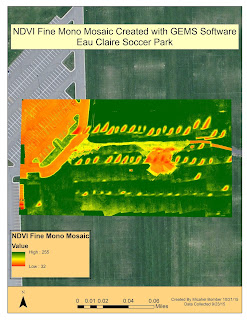
Figure 8 This is the Fine NDVI Mono Mosaic
The fine NDVI mono shows the reflectance levels as a high to low. The GEMS software does not assign a color scheme to this NDVI. Healthy high reflectance areas are white and low health is gray to black. This fine NDVI is better than just the mono NDVI (Figure 10) and by better I mean more accurate.
Figure 9 This is the Fine NDVI Mono Mosaic in ArcMap
This is that same NDVI in figure 8 only I assigned a color ramp to the values in ArcMap. The green areas are healthy and the oranges and reds are dead even the path which is yellow is also dead. The mono NDVI gives you the ability to choose which ever color scheme you prefer in ArcMap to display the data.
Figure 10 This is the NDVI Mono Mosiac
This is the normal mono NDVI. This one isn't as detailed as the fine mosaic. Again it is showing the reflectance levels. Below I brought it into ArcMap and changed the color ramp.
Figure 11 This is the NDVI Mono Mosaic in ArcMap
If you look in any of the maps above in the mosaic from the UAV you will see some striping that doesn't look quite right. The stripes run from the lower left to upper right of the images. This is an error in the mosaic created when the images were being stitched together. If you look very closely you can see that those stripes are where two or more images come together. This could be an error when the GEMS software ran the NDVI initialization and it is supposed to make all the values uniform. There are not big dead patches of grass in the soccer park.

Discussion/ Critique

Pros

The GEMS sensor and software package give the user a very simple and straight forward way to collect aerial imagery and also run simple analysis on the data. Its light weight, small size and being a fully autonomous sensor makes it ideal for a wide variety of platforms and situation.

The software is very easy to use and the user interface is very easy to follow. A person with very basic of UAVs and vegetation data analysis is able to use the software and produce useful mosaics. The file structure that is established while collecting data and running the analysis makes it very simple to stay organized and find the different file types created. 

Cons

There are two areas that would greatly improve the usefulness of this sensor. First is the very poor pixel resolution. 1.3 mega pixels is terrible when thinking about how advance camera technology is. This low resolution limits what this sensor can be used for. The cameras may be sufficient for agricultural application however this sensor can and should be used in other industries. Surveying mines and doing volumetric analysis is one area that this sensor would be great with better cameras on it. In order to do the volumetric analysis you need very high detail images, 20 to 40 mega pixels. The SX260 camera which is a 12 mega pixel could also be used. This would not a hard problem to fix with the GEMS sensor. With phone camera technology as advanced as it is one of those cameras could easily replace the existing camera and make the unit more versitile. Another area when this sensor would be great to use with better cameras in search and rescue applicaitons. High resolution images are needed when you are looking for an object in the woods or elsewhere. This sensor is so light that it does not hinder flight time very much and with better cameras could be very useful in this industry. Even in agricultural applications better cameras would be ideal. Right now you can look at the overall health of a large area but in some fields of agriculture like vineyards they want to look at each individual plants' health. You need a much higher resolution camera in order to do that. My recommendation is that a camera of at least 12 megapixels be implemented into the GEMS sensor. This would greatly expand the areas in which it could be used.
The other area that needs improvement is also linked to the camera. The field of view for the present camera is only 30 degrees which is basically straight down. This reduces distortion in the images but it also makes the flight grids way too tight with the sensor. Close flight lines means longer flight times to cover small areas. Many platforms don't have flight time past 20 minutes to a half hour and when using the GEMS sensor they may have to do 2 or 3 flight to cover an area that could be covered in one flight with a different camera. I would suggest a camera with at least a 60 degree field of view. Some may argue that the images will be distorted but that is not true. If the image over lap is sufficient, usually about 75 percent, the distortion will be very minimal. 

For the software the only suggestion I have for improvement is the file naming convention for when the flight were taken. The format as it is right now needs a online translator to get it into a date that the average person can understand. A format of Month-Day-Year and Hour- Minutes-Seconds would be much easier to understand.

In conclusion, I do like this sensor and software but my continued use of it will hinge on whether or not improvements to the camera are made. The present camera really limits what this sensor is used which is unfortunate because there are a lot of very convenient features that make this sensor a go to for imagery collection on a UAV.


Wednesday, October 14, 2015

Activity 5: Obliques for 3D modeling construction

Introduction

This week we used a completely different image gathering technique. All the other image collecting mission have been flown at 90 degrees or in a Nadir format (Figure 1). Nadir imagery is great for looking at spatial relationships between objects on the ground but it does not pick up on 3D objects very well. You only get the rood roof of the structure. This week we collected the images at a 45 degree angle or in an oblique format (Figure 2). Collecting oblique images allows for the construction of 3D images, which is a big up and coming area of study in the UAV industry. By taking the photos at a 45 degree angle you can get the side of the buildings from all angles and also fly the roof structure giving you a near perfect 3D representation of the structure you are imaging.
Figure 1 This is a Nadir image collected a few weeks ago of the pavilion from about 60m up. The camera is facing 90 degrees to the Earth's surface and does not pick up on 3D objects very well. In a 3D rendering of this image the roof of the pavilion would be higher than the area around it but the sides of the building would not be modeled they would just be black spaces or nothing.

Figure 2 This is an oblique image collected at 45 degrees. Multiple pictures taken from this angle allow for the construction of 3D models.

Study Area

The study area for our 5th activity and final activity in the field for the semester was again the Eau Claire Sports Center soccer complex (Figure 3). It was a beautiful day, couldn't ask for better weather in the middle of October. It was around 65 degrees, slight winds with light wispy clouds and a lot of sun. We flew the image collection mission right away to assure we had proper lighting on the structure because the sun goes down pretty early this time of year. For the oblique imaging we chose the pavilion in the middle of the fields. It is a + shaped building approximately 5m high to the roof peaks. It is in a good location to fly because there are no tress or flag poles near by to interfere with the image gathering.
Figure 3 This the soccer complex where we conducted this weeks flights. The red circle is around the pavilion we flew to create a 3D model of in the next few weeks.

Methods

We used two different platforms this week to gather imagery as well as two different cameras. The first mission was flown with the Iris (Figure 4) platform made by 3D Roboics. Attached to the platform was a GoPro HERO3. The GoPro isn't the most ideal sensor for this application because it does not have an internal GPS. In order to make a 3D model with the GoPro GPS locations form the flight log are joined to the JPG files to create the model. The Mission Planner app also made by 3DR has a function called structure scan. In this function you find the structure you want to fly on the base map of the app. Then you click a center point directly over the center of the structure. You then set the radius of the circle, how high the platform should fly and how many times it should change altitudes during the flight. For the Iris flight Dr. Hupy set it to start at 5m altitude and take a picture every 2 seconds as it flew in a circle around the pavilion. The Iris then would increase altitude by 4 meters each time it went around the structure all the way up to 26m. It is easy to visualize if you think of the drone flying a corkscrew pattern around the building. Once it reached 26m Dr. Hupy set a cross pattern across the top of the roof to ensure that the roof structure was adequately imaged.After the Iris completed its auto mission I flew it manually around the building at approximately 2m to get the lowest part of the pavilion as well as under the over hangs so that when we create the model even the areas under the roof canopy will be imaged and not just come up as black space. The auto pilot app for gathering oblique imagery was really cool to see work as this was the first time any of us had ever used it. As always I was at the controls ready to take over if the Iris got too close to the building.The flight was only about 5 minutes of auto pilot and it collected about 150 images so doing a structure model like this doesn't take a platform with long battery life. That is why the Iris is good platform to use for this kind of data collection. Its compact size is also ideal.
Figure 4 This is the Iris with e GoPro mounted on a gimbal. The gimbal allows the user to rotate the camera up and down, left and right to get the desired angle for imagery collection. 


The other platform we used to fly the pavilion was the DJI Phantom (Figure 5). The Phantom is another very compact platform with a short battery life ideal for this application. It is also equipped with a very high resolution camera that comes as part of the platform. The Phantom geotags all the images it takes or in other words assigns a lat/long position to each image which makes 3D model creation much easier because the image processing software looks at those geotags and arranges the images according to them. There is no need to use the log file GPS points like when you use the GoPro. The Phantom mission was flown completely in manual. There is an auto pilot app for the Phantom but Dr. Hupy has been having trouble with the app crashing mid-flight which is a safety hazard and does us no good if we can't image the whole structure. Everyone in the class got a chance to fly the Phantom and collect images. The same corkscrew pattern was flown, as best as could be done, and the cross-hatch over the roof was also done just like in the first mission. The camera was kept at approximately 45 degrees during the flight to ensure we were collecting oblique imagery and not Nadir. The Phantom flight took about 15 minutes and just under 200 images were collected.
Figure 5 This is the DJI Phantom. The camera is also on a gimbal but this camera is part of the drone unlike the GoPro. The geotage feature of this platform makes it ideal for image collection and the very compact size makes it perfect for structure modeling, because the user can get into small areas.

Discussion

Oblique imagery collection is a totally different method than Nadir image collection and you have to have a different mind set when flying this type of mission. There is more attention to detail because you have to make sure every inch of the structure is imaged. One image for each surface will work but multiple overlapping images on each surface will give you better 3D model and greater detail. Both of our flights probably had way more images than are necessary. The Iris auto pilot flight collected around 150 images and you could probably create a 3D model from 50 or so images but our model will be better. Image overlap is important in oblique imaging just like when collecting Nadir images. It would've been interesting to see the Phantom fly an auto pilot mission to see how it flies compared to the Iris. The Phantom has a tendency to fly smoother than the Iris, this is especially true when I have flown it in manual. I am excited to see the 3D model in a couple of weeks when we run this data. This summer Dr.Hupy imaged a shed at South Middle School garden and it turned out really well so it will be interesting to see how this one turns out and compare the two. 

Conclusion

Oblique imagery is a great way to create 3D models. There are many applications for this type of imagery collection. Bridge inspections, roof inspections, and insurance damage claims are a few areas where I see this technique being very useful. You can create 3D models and with the high picture resolution and insane detail capabilities with some of the platforms available you could easily find cracks, dents or whatever you are looking for in the inspection and not only be able to look at it live but also have a 3D model that you can look back on later. The reality business could easily use this for creating virtual tours of properties or at least being able to click and drag a 3D model of the house on their website. This would make it more interactive for the home buyer and not only be able to look at a bunch of JPGs but pan and zoom on the whole structure again with crazy detail. As the UAS field continues to grow and rapidly expand it will be interesting to see what other applications this can be applied to.